Tutorial 3

Where I am so far:
  • Always consider what symbols, shapes and composition means and how it communicates to the audience.
  • What exactly am I trying to say to my audience?
  • Who am I saying it to?
  • Does this style work with my audience?
  • Is it effective?
  • Make a logical journey.
  • Consider the content.
  • Figure out the touchpoints - where can I catch my audience?
Target Audience:
  • My target audience is in the age group of 18-24 year olds, primarily University Students.
  • I have chosen this age group as they are overlooked generally within this topic.
  • Children and Adults receive different treatment for depression, however people aged between 18-24 are technically classed as neither, making the treatment difficult to judge. This is a gap in the market.
Methods of Delivery:
  • The initial point of contact will be screen based - the vast majority of people in this age group have access to a screen of sorts.
  • Another reason to back this, depressed people lock themselves away - a subtle way to get the message out as they too have access to screen based communication.
Intention:
  • I am producing adverts and a campaign for informational, educational and awareness reasons.
  • I will explain the avenues and possible directions to take in order to prevent depression.
Information is out there, however in order to become aware of this issue, you need to go looking for the details. This project is making the link between the person/people and the help.
It is not about making or persuading, it is about informing the options available.

An Animation


According to my survey results, the vast majority of people feel that a TV advert of some description would be the best way to communicate the topic of depression.
As it can be a very sore subject to talk about and approach, I think a friendly, simple way of displaying relevant information would have the best effect. The TV adverts I make are going to be animations, the characters are presented above. The reason behind the animations, are to make the topic more approachable to talk about, and make them differ from the common adverts using real people today. 
Depression is a very personal illness as it varies from person to person, and can effect each and every one of us for any reason at any time. It is for this reason in particular that I am against using real people trying to act a feeling/emotion which could completely mis-interpret and mis-communicate the problem. By using simple animations, the style will stand out in the hope that people will take interest. From here the message can be slowly introduced - but also gives the audience an option whether to take notice or not. The animations will tell a story, but only enough to introduce the problem. 
The animation will then direct the audience to a website where they can find relevant information about what to do and how. This website will direct to a page with links to sites such as NHS. 
My characters and symbols shown previously will form the basis of my project in order to communicate this issue appropriately.

Building on my Symbol Designs


© Megan Corkhill
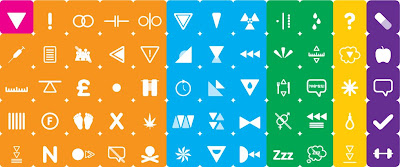
Following on from my symbols regarding the types of depression, I have built up a table to explore how I can simplify the whole topic. The pink box containing a filled triangle is my symbol for 'Depression', I have specifically chosen a triangle because of the down feelings involved in this illness (hence the reason that the triangle is pointing downwards). The orange boxes represent the different causes of depression, blue shows the types (also shown earlier in this blog), green representing the physical symptoms, yellow for the psychological and purple showing the different treatments.
This symbol system will form the basis of my project in order to communicate my chosen topic to my target audience.